
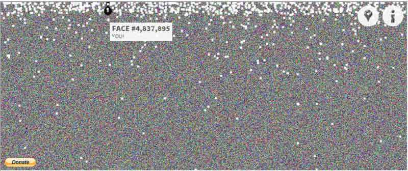
Find yourself: The site also lets you 'connect' with your own Facebook account to let you find your face # and see where your face appears in the vast density of profiles. Connecting your Facebook account to the app also highlights your friends on the map as larger white dots, letting you see: Who joined first, and who joined last.
Miami-based Rojas has developed the project using HTML5, Javascript, CSS, jQuery, EaselJS, Ajax, FB API, PHP and MySQL.
More amazing visualisation tools like Faces of Facebook:
This is not the first time a developer has tried to visually showcase social profiles and connections on the Internet.
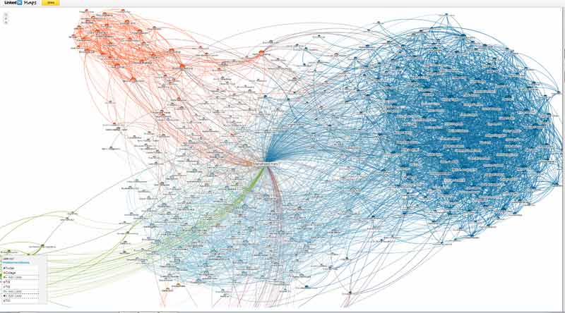
LinkedIn's In Maps
LinkedIn for instance has a map that lets you see your connections called In Maps (http://inmaps.linkedinlabs.com/). The tool displays coloured codes that represent different affiliations or groups from your professional career, such as your previous employer, college classmates, or industries you’ve worked in. You can use the mouse scroll to zoom, click on a connection's name to get more information and label the color-coded clusters to describe your relationships.
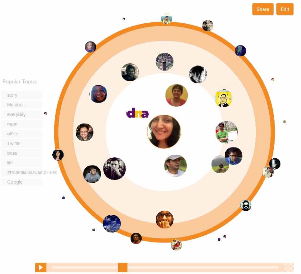
Vizify's Connections for Twitter
Then there is Vizify Connections (http://vizify.com/connections), that lets you view a visualisation of your Twitter connections. Within seconds, it builds an animated and interactive infographic of your network by creating concentric circles to show how often you've tweeted at/with a person. It categorises people based on their interactions with you. The two broad categories are:
The Rock: We interact all the time
The Pal: We interact with some regularity
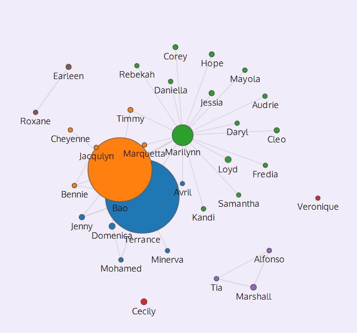
MIT's Immersion for Gmail, Yahoo Mail and MS Exchange
Another interesting tool to view a people-centric history of your email life is MIT's Immersion (https://immersion.media.mit.edu). Immersion uses your email metadata including: 'the From, To, Cc and Timestamp fields of the emails in the account you are signing in with' to show your top collaborators.
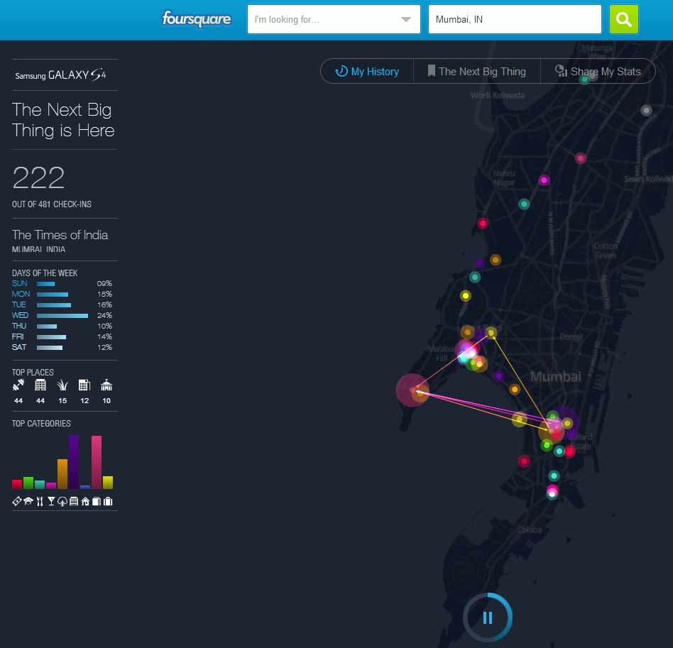
Foursquare's Time Machine
Foursquare offers a service called Time Machine (https://foursquare.com/timemachine) that crunches the numbers of all your check-ins to display them on a colourful animated geographic map. It also gives stats on Top Categories of places you visit and a total number of checkins.
Wolfram Alpha's Facebook Report
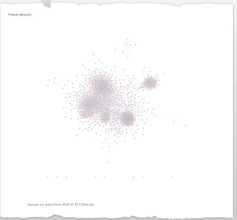
You can also generate a 'Facebook report' (http://www.wolframalpha.com/facebook/) using search engine Wolfram Alpha that has a few visualisations including one that lets you see the structure of your network on the site. However, I couldn't zoom in to my connections using the map and won't recommend this one.
No comments: